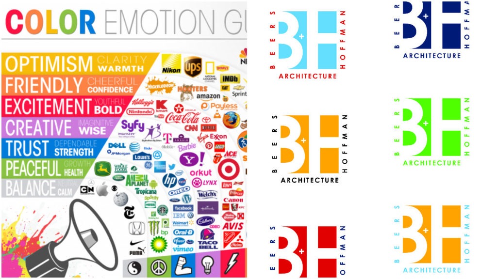
Your Brand, your Company Logo is very important. Consistency is key in branding.
If you start putting variations of your business image out there, your brand continuity and reputation will be hurt. Changes in colors, fonts, shape or overall design will cause confusion. Consumers can’t see variations and understand it to be one company/brand. Each one will look different to them and be confusing. Your logo/brand needs to be consistent across everything.
When you see a logo, you don’t necessarily see the image/font and know immediately what company it is – you see color first. Consumers will see the color first, then the graphic image/font. You change color and your brand gets confused in the mind of consumers. Some companies actually register their logo color so no one else can use it, for example Kodak yellow. Think of the Coca Cola logo – what do you think of first – not the font or logo design, but you think of their Red color first – you see that red and you know it is Coca Cola, not Pepsi or some other soda brand. That is how a good logo works.
Look at logos all around you – do they change color for different applications? Website, Signs, Ads, promo items etc.? They may be all black or all white at times depending on the application but when used in color they don’t change per marketing piece.
When a logo is created, ONE Color scheme is selected and then a Black version and a White version is made and sometimes a grayscale version as well. These 3 or 4 versions alone will work for all applications. The Black, White or Grayscale versions can be used in place of the color one on all kinds of materials, some of which the color one may not look as good on. A lot of promo items come in colors so you can pick a color that is your brand color and then print a white or black logo on it.
Creating different color logos dilutes the brand because the use of multiple colors takes away from the notion of a company owning a particular color and creates inconsistency in a brand.
There are examples such as FedEx vs UPS. Several years ago FedEx redesigned their branding to have different color schemes based on their services. There was a common color (Purple) throughout so consumers could make the connection, but now they have gone back to their original colors (Purple and Orange).
Whenever different colors are used for one logo there is always a clear reason why, such as the service listed with the color scheme like FedEx did, but like I said they now went back to the original. It ends up hurting the brand.
Compare UPS which also redesigned their logo and has kept with a continuous color – they are doing much better business. When you think of shipping you think UPS. FedEx is always 2nd.
When choosing a color or color combination, keep in mind your customers/audience as well as selecting something that will make your company stand out among competitors to make you unique. As mentioned above, people notice color first and it means something to them and gives a message about your company.
A good logo stands out, communicates a message, creates a brand and overall summarizes the company in one symbol/graphic.
